case study

Shape Homes

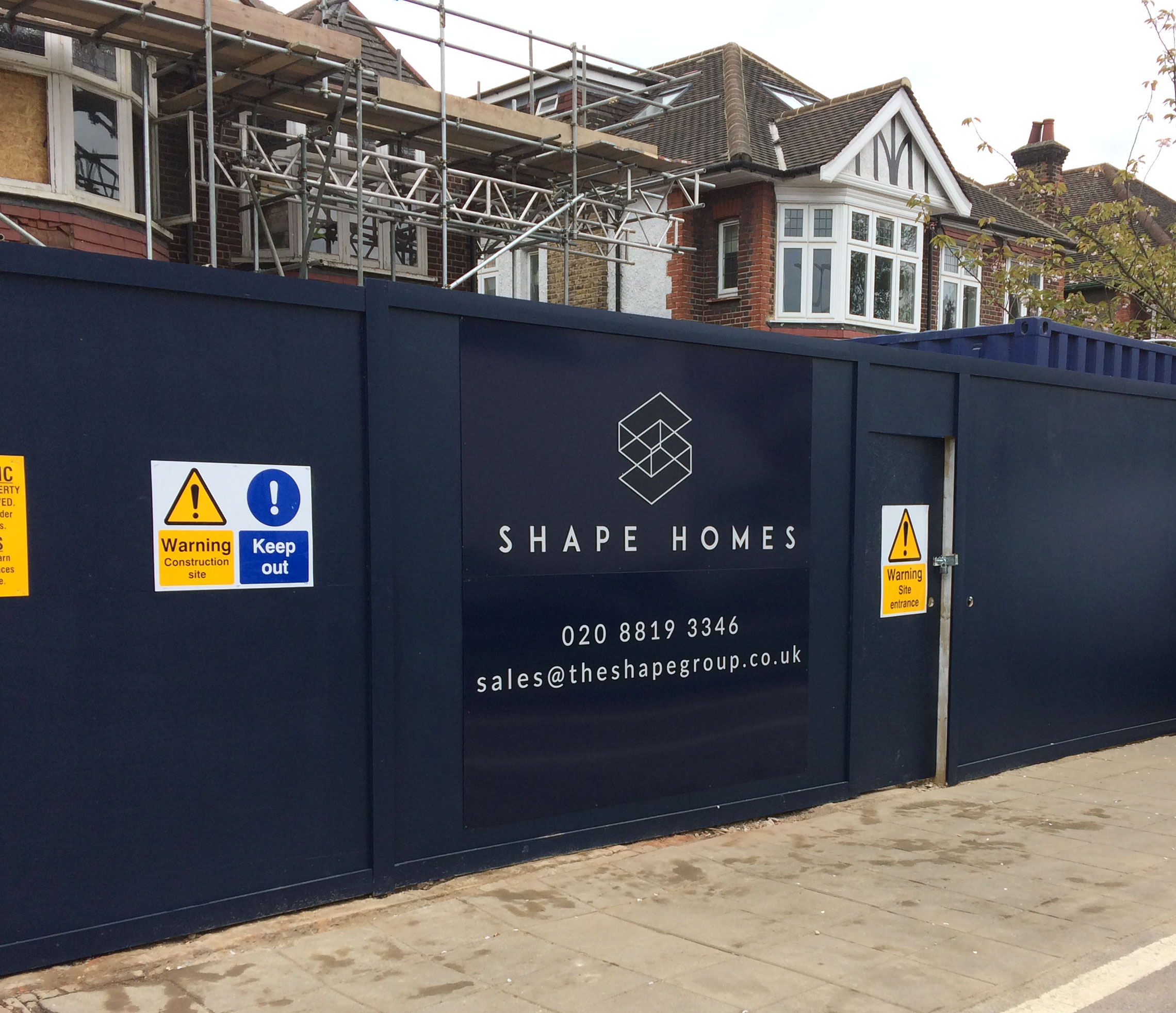
Shape are London's leading extension firm, specialising in domestic construction and creating beautiful homes.

The brief was to develop a visual identity that would cater to Shape's target market and reflect their brand values and aspirations.

The Logo

Three stacked rectangles representing floors in a building form the basis of the design.

Deleting opposing segments creates a geometric ā€œSā€ icon. The design has the spirit of a technical drawing which conveys precision and attention to detail.